Lifestyle:
The genre I have chosen for my magazine is lifestyle consisting of topics such as books, music and travel. This magazine will be targeted towards men and women aged 16-25 who are interested in such topics as stated above. The aim of my magazine is inspire creative people and inform them on different areas to develop their creativity.
Purpose of my magazine:
The purpose of my magazine is to inspire the younger generation who are creatively driven.
Target audience:
- Younger Generation aged 16-25
- Targeted towards Men and Women
- Interested in travel, books, music, photography and lifestyle
- Open minded and accepting audience
- Explorers who want to discover new things
- Positive attitudes
- Inclusive, for all races, gender identification and sexual orientation
- Aimed for BC1C2 audience who are students with a lower income so i can reflect this in the advertisements which can be used within.
Through research of a variety of different covers and double pages spreads of the same genre to give me inspiration in terms of colour, layout, fonts and other necessary conventions which are needed when producing a magazine cover and double page spread. This will also help to directly target my target audience. Some magazines i researched which linked to my choice of genre is as follows:
- Frankie Magazine
- Freeman Homes' Lifestyle Magazine
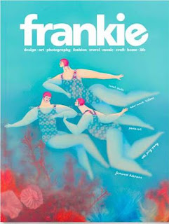
Frankie Magazine:
Frankie is a magazine aimed towards those are creatively driven, particularly women who are explorers and enjoy learning new things.
- Bright colours make it seem fun and inviting
- Drawn image on the front, reflecting the idea of creativity
- Soft font but still stands out well, top centre, easy to spot
- Having cover lines under masthead keeps everything together and easy to read. seems sophisticated
- Looks nice so can be used as decoration, further attracts those who are creative.
Lifestyle Magazine:Lifestyle is aimed more towards those at the end of my target audience who would be more interested in the home aspect of this magazine however it would still be effective for those younger who would be interested in travel and the environment.
- Similar to Frankie in terms of having the main focus of the magazine directly under the masthead, draw attention to it
- Masthead top centre, black text stands out against background
- Having a boarder around the image bring attention to it and makes it stand out nicely.
- Having more cover lines around around the edge of the page allows further detail into what articles will be included in this particular issue
Double Page Spread:
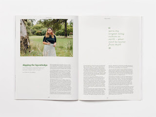
This Frankie double page spread use minimal images and has a balance of white space and content. The colours used in the heading link to the picture nicely creating continuity throughout the spread. There isn't a large amount of text however there is enough to make it worth reading. The pull quote is a question which will attract the audience and they will want to find out the answer. I like that the image is only on one side so the focus is more one the article rather than only the image.
Content list for Cover:
- Genre- lifestyle, travel, books, music
- Masthead- large, soft font, top of page, stand out against coloured background
- Pictures- no people, focus on what the content will be about, headphones, book included in DPS, muted colours
- Cover/ sell lines- link to latest music releases, book of the month, places to travel to this year
- Colours- background pastel colours, bright text colours
- Typography- clear, appropriate size to be able to read
Content list for Double Page Spread:
- Genre- lifestyle, book review
- Content- review of book featured on cover, tips on how to annotate books
- images- two pictures overlap, model holding book over face so only eyes are shown
Names for magazine:
I wanted to use a name that would link directly to the genre of lifestyle. However I didn't want it to be just the word lifestyle. I liked the idea of it being the phrase 'That's life'. I experimented with using this phrase in different languages such as 'E La Vita' which is italian and 'C'est La Vie' which is french. I chose to go with 'C'est La Vie' as I felt it was easier to pronounced and looked nice on the page. it feels sophisticated but also fun. I am now going to look on Dafont.com to create some Mastheads and hopefully also find a font to use for my cover lines.
Experimenting with different fonts:
Travelling By Vladimir Nikolic:
This font looks soft and inviting but isn't really what i'm looking for in terms of masthead as it want it to look elegant like the phrase itself. I decided to keep this as an option for the cover lines as I felt it would fit there more.
Caramel and Vanilla by Cat.B:
I like the brush stroke look of this font but I didn't like how thick it was. it would stand out quite well however. I feel this would really attract my audience as it doesn't look fun.
Ayus by StringLabs:
This font is closer to what I want for the masthead however I still don't like how thick it is. it's still clear however I don't like how close the apostraphe is to the letter C, so it harder to see. Therefore I didn't pick it.
Mandoul Brush by Man Greback:
Similar to the one above, I linked the paint brush effect of this font and the fact it looks like some of the colour is missing. this aspect really adds to the idea of this magazine being targeted towards those creatively driven. Despite this, I don't like the way L looks in this and how close the apostraphe is once again too close to the C.
Rock Better by 50Fox Studio:
This font is exactly what I want for the masthead. It isn't overly thick but is still clearly visible and eye-catching. Moreover, it also has the brush stroke aspect to it which I think is perfect for magazine for creative people. It also looks very elegant which is something i was really looking for. I think this will work really well with everything else I want to include on the cover.
Experimenting with coloured fonts:
I decided to go with Rock Better with the first letter of each word capitalised and it looked much nicer than having all the letters that way and adds to the elegant aspect I was looking for. I also liked it for the brush stroked look as previously mentioned and i think it fits very well with the aesthetic of the entire cover/the magazine. Moreover, none of the letters are too far apart or not far enough, it is all perfectly spaced.
I don't really like the look of the dark colours such as the red and the purple as I want to have a boarder around my image and masthead which will be a pastel colour so I feel it is too much of a contrast between that and these colours. I also don't think that darker colours work as well with this font.
I like the look the look of the green, yellow and white in this font. I think it looks nice and bright and really catches the audience attention. The grey doesn't work as well because of how dark it is so I don't think it will stand out as much as I want it to.
I'm thinking of using a pastel blue as the boarder colour for the cover therefore I don't think using a shade of blue for the masthead would be a good idea. The purple is a nice tone so that can also be an option to use as it will look good with the boarder colour.
From looking at a range of different colours, I have come to the conclusion that I prefer lighter colours as it really reflect fun and eye-catching aesthetic i'm hoping to achieve. it also works well with the font itself seeing as it isn't as thick/bold. There are multiple colours I can use so I can look into this more when I start getting images and deciding what colour the boarder it going to be. I want all the colours i use to compliment each other nicely.
Coverlines:
From the covers I have looked at from the same genre I'm using I have seen that there are minimal coverlines used, typically no more than three. I liked the idea of their being some cover lines directly under the masthead which reflect an overview of what will be included. There will then be sections with more detail on what is specific to this issue along with which page number this information will be on. This should be effective for my target audience as it will be easy for them to navigate.
Coverline ideas:
- latest music releases: recent music with all the right vibes
- spring staples
- book of the month: 'did that really just happen?!'
- 5 ways to make your insta page go viral
- bucket list: aesthetic places to visit this year
- review: which headphones are loudest
I decided to go with latest music, book of the month and bucket list as I feel these sections work well together and compliment each other. They can clearly link together and having them on the cover really shows that and will lure the audience in.
Layout of front cover ideas:
This is the general idea I have for the layout of the cover. The only thing which may change is the colour of the boarder/background and this will depend on the image that I choose to use in the end. The colours used here are: #FDFFA0 pastel yellow. #A0C3FF pastel blue. I like the look of these colours as they look soft and will look nice on display which.
Shoot plan one:
Location: Inside
Props: Book
Model: Emma
I took these photos at home with my mum as the model. These pictures were not what i was going for at all. I really don't like the lighting, she is completely back lit but there are also shadows everywhere whilst also having high key lighting on her front. These photos do not look professional with this lighting. Moreover, we struggled to figure out the posing however I want to try again in a later shoot to get this pose perfect as it's something I want to include. In one of the pictures, Emma has her eyes closed so that image wouldn't work at all but I really dislike all of the pictures but at least I now know I definitely want to use this pose in a future shoot.
Shoot plan two:
Location: Inside, Dining room table
Props: Headphones, Book, Candle, Hairclip, Tea.


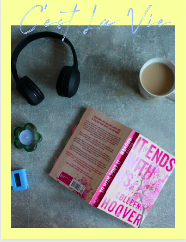
I took these pictures at home as I wanted it to have a cosy vibe to it. I have decided against editing any too much other than the odd crop to make sure that everything fits. I took many pictures using all the same the items in different variations so I had the chance to go through them all and find the ones that I liked the most. i chose to do different angles, one birds eye and one at a slightly lower angle. After reviewing these, I prefer the birds eye view as I feel it just looks nicer and cleaner. By showing these different items, I feel it really will attract by targeted age demographic of 16-25 as they would be interested in these things. This may seem as though it is aimed more towards women however I feel that anyone can enjoy these items and I want to reinforce this idea that items aren't refined to one gender. I have decided to go with the image below as I like the way everything is positioned and that the lighting is bright on the book, drawing your attention to it but you can also see everything else nicely as well. Its also a nice size to fit on the page with a boarder around it and space for the cover lines along the bottom.
Overall, I chose this photo as I feel it perfectly encapsulates the vibe I want for this cover. I really like the lighting on this image. The high key lighting on the book attracts the attention to the book straight away. It also makes the magazine seem bright and inviting for any group of people. On the other hand, the low key lighting also works really well in terms of the shadows from the items. I feel that this makes the magazine seem mysterious and exclusive in some way which I hope will resonate with the audience. These items also work well to attract a young/teenage audience as they are likely to use them often.

Before starting on my final design using the layout I had originally designed, I decided to experiment with the different aspects first to see if I liked anything more. Personally, I feel that this layout and colour scheme doesn't really work for a lifestyle magazine. Everything looks far too sophisticated for a younger audience; especially in terms of the contrast between the bright colours in the picture with the dull colours used within the background. I also really dislike the colour of the text as I feel it looks really boring and would not attract the audience I would want it to. Furthermore, the fonts don't work with the vibe I am going for either as they look far too rigid and sophisticated for something that aims to attract a younger audience. I am happy I did this though as it gave me a chance to try new things but they clearly won't work for this.

I then added my masthead because I needed to check that the font looked good with the image. I also needed to figure what colour I wanted to with for both the masthead and the boarder. I decided that the yellow masthead and blue boarder worked well together and the yellow looks nice with the font. It looks soft and inviting whilst also attracting the audience attention.

I then added the price and issue number to the cover. I decided against having the barcode on the front as i could find a nice place to have it so I just included the price. I also chose to add the issue number so the audience know the order of the issue being released. These two things are placed at the top so they are easy to locate but don't take too much attention away from the masthead. I wanted this magazine to be affordable for college/uni students as they are the targeted age demographic for this magazine. Therefore, I chose to charge £3.99.

I next added all of the coverlines to make sure they all fit nicely. I added a cover line directly under the masthead which states what is in every issue of the magazine. I think it looks sophisticated and is effective as people will always know the general idea of what will be included so they know whether they will be interested. I chose to have this line use the same colour as the masthead so they fit together. The cover lines along the bottom are situated so the main image can still be seen easily without being covered too much. These cover lines all include appropriate topics which would attract my target audience. I also included a cover line for what my double page spread was going to be to reinforce it's importance. I chose to put the cover lines in white as I feel it helps to make them stand out against the cover image. I used a variety of fonts as I wanted it to look fun and experimental. I think this cover is very eye catching through the use of all the different colours and layout of everything.

I decided to make another cover with a different layout and image to see which i preferred. I like the fonts and colours on this cover, i think they work really well together. They yellow is bright and eye catching so it should attract the audience. The image also works nicely with the vibe of the magazine in terms of what is included in it. I also like the fact that I tried it without a boarder this time to see if I liked this more compared to the previous design. I also chose to position the cover lines in another place to see how they would fit. This works well with this cover as it means you can see the image more clearly however i'm not sure it would work on the other cover. Furthermore, I included a barcode this time as there wasn't one of the other. Once again, I like it on this cover however i'm not sure it would work on the other one once again. I am going to print this out as well as the original cover I made in order to compare the two to see which looks better.
Shoot plan for double page spread
Model: Sophie Ricketts
Location: Outside, field
Camera Shots: Close up of book over face, long shot holding book up in the air
Makeup: natural
Clothing: patterned jumper, black trousers
This was one of my favourite images I took as it was actually taken by accident however i really like it for that reason as it makes it seem very candid. I also like the fact that you can’t see Sophie’s face as the main focus is the book itself. The bright natural lighting also works really well against the vibrant colours of the jumper and annotation tags within the book itself. I think this will appeal to my target audience as they are youthful and therefore like vibrant/fun images which will attract them into reading more.

I liked the look of the two images above however I decided not to use either one of them as this time I wanted to use an image with Sophie’s face just so there is a contrast between the two images I wanted to use stacked on top of each other. I did like the background of this image more than the first which is why I repositioned Sophie when taking the pictures in order to have this background in the next few photos.
These last two images were also ones I liked more than others so I knew I wanted to use one of these with the other image as I liked the contrast of one image of just Sophie’s body and then one with her face in it. It also helps to keep the focus on the book which will be covered in the DPS by having it in the middle of the image, drawing the audiences attention to it. I also found it to be beneficial to use the book that the review is about in order to keep continuity within the DPS.
I decided to go with these two images in the end as they were the two which stood out to me the most. I think they work really well together when layered together. I knew that this was a creative aspect I wanted to include to help break up the page a bit more rather than it just looking more boring. Moreover, the colours are really bright and colourful which I think really fit the vibe in going for with this magazine and will resonate with the target audience.
Double Page Spread Article:
For my article, I will be doing a review of the book 'It Ends With Us' by Colleen Hoover. I want this to be informal and fun so it is enjoyable for my target audience. It is going to be chatty and feels as though the audience are a part of the conversation. By having it less formal, it will also appeal to the targeted demographic I want. This is effective for students as it will a light/easy read for them.
Draft Article:
As i'm sure you are all aware, this months book of the month for March is 'It Ends With Us' by Colleen Hoover. This book became an overnight sensation not so long ago and people continue to read and rave about it. Before this review begins, it is important that I remind you all of the content warnings for this book. As always if the following areas aren't for you, i'll see you next month with our next read. Content warnings are as follows: running themes of abuse (domestic, emotional , etc), loss of a parent, suicidal thoughts, blood and sexual abuse. For more information about the other content warnings i'd do more research before picking up this book. Spoiler warning for the rest of this article, if you haven't read the book and don't want to know what happens, why the hell are you still here?!
This book follows Lily who is a 23 year old graduate who grew up in an abusive home and is starting a new life in Boston when she meet Ryle, a resident surgeon who seems perfect on paper (excuse the pun). As their relationship develops, someone from Lily's past makes an appearance- Atlas, who was once a homeless boy who Lily helped when she was younger. He supported Lily throughout her terrible childhood. The reemergence of Atlas reveals cracks within Lily and Ryle's relationship, thus revealing that Ryle has similar tendencies to that of Lily's own father. Lily herself reacts in similar way to her own mother as well. Following a fight, Lily flees to stay with Atlas for a few days all whilst discovering she is pregnant! The novel ends as Atlas and Lily decide to rekindle their childhood romance.
This book is so well written by Colleen Hoover. The way she write Ryle in the beginning really made me like him as a character. He seemed like such a good person and it seems they were going to be a great pair. (it's important to note that i had no idea what this book was about before i read it). That's why when the abuse began I really wasn't expecting it at all. This is one reason Colleen is such a good writer, she really knows how to manipulate the reader's emotions. I also really enjoyed the use of the journals as a flash back to when Lily first met Atlas, it really helped to develop the storyline and show why their initial relationship didn't work. Also, the connection between Atlas, Lily and the Ellen Show was really my favorite part of the entire book. I think it's what made me enjoy the ending so much however i am very glad that there will be a sequel! I really appreciated the fact that after Lily leaves Ryle she doesn't go straight to Atlas and starts a relationship with him, it makes everything feel more real. She clearly needed more time to focus on herself and that was important to the story.
Overall, I gave this book 5 stars simply because of how well written it was well and how beautiful the story between Lily and Atlas was. I was not expecting anything that happened and even after re-reading it, I had the same feelings/surprise i felt when I first read it and that is a difficult feature of a book to find. I would highly recommend this to anyone. As always, head over to our instagram page @clvmag to let us know what you thought about this book and whether you would like us to include a page in next month's book of the month issue with all of your reviews in. Now next month's book has been highly requested for a while so I know you're all going to be very excited about this one. We will be reading ' The Seven Husbands Of Evelyn Hugo' by Taylor Jenkins Reid! I have also been very excited about reading this one. I have actually already started this one and i can tell it is going to become one of my new favourites. Don't forget to check out the playlist we made for this book, you all seem to enjoy these. It'll be somewhere on this page! That's all for this month, see you next time!
When putting the double page spread together, I found that the article was too long and there wouldn't be enough room for images within the spread so it needed refining. I decided to remove the section which basically explains the entire plot of the book. I felt that this was really an unnecessary section within the article as those reading the review will have already read the book so should hopefully know what happens. If not, I'm sure it's easy enough to research what it is about before reading the review.
Refined Article:
As i'm sure you are all aware, this months book of the month for March is 'It Ends With Us' by Colleen Hoover. This book became an overnight sensation not so long ago and people continue to read and rave about it. Before this review begins, it is important that I remind you all of the content warnings for this book. As always if the following areas aren't for you, i'll see you next month with our next read. Content warnings are as follows: running themes of abuse (domestic, emotional , etc), loss of a parent, suicidal thoughts, blood and sexual abuse. For more information about the other content warnings i'd do more research before picking up this book. Spoiler warning for the rest of this article, if you haven't read the book and don't want to know what happens, why the hell are you still here?!
This book is so well written by Colleen Hoover. The way she write Ryle in the beginning really made me like him as a character. He seemed like such a good person and it seems they were going to be a great pair. (it's important to note that i had no idea what this book was about before i read it). That's why when the abuse began I really wasn't expecting it at all. This is one reason Colleen is such a good writer, she really knows how to manipulate the reader's emotions. I also really enjoyed the use of the journals as a flash back to when Lily first met Atlas, it really helped to develop the storyline and show why their initial relationship didn't work. Also, the connection between Atlas, Lily and the Ellen Show was really my favorite part of the entire book. I think it's what made me enjoy the ending so much however i am very glad that there will be a sequel! I really appreciated the fact that after Lily leaves Ryle she doesn't go straight to Atlas and starts a relationship with him, it makes everything feel more real. She clearly needed more time to focus on herself and that was important to the story.
Overall, I gave this book 5 stars simply because of how well written it was well and how beautiful the story between Lily and Atlas was. I was not expecting anything that happened and even after re-reading it, I had the same feelings/surprise i felt when I first read it and that is a difficult feature of a book to find. I would highly recommend this to anyone. As always, head over to our instagram page @clvmag to let us know what you thought about this book and whether you would like us to include a page in next month's book of the month issue with all of your reviews in. Now next month's book has been highly requested for a while so I know you're all going to be very excited about this one. We will be reading ' The Seven Husbands Of Evelyn Hugo' by Taylor Jenkins Reid! I have also been very excited about reading this one. I have actually already started this one and i can tell it is going to become one of my new favourites. Don't forget to check out the playlist we made for this book, you all seem to enjoy these. It'll be somewhere on this page! That's all for this month, see you next time!
Playlist:
Sparks- Coldplay
Tired- Beabadoobee
Apocalypse- Cigarettes After Sex
I Love You- Billie Eilish
What A Time- Julia Michaels and Niall Horan
Sign Of The Times- Harry Styles
I Bet On Losing Dogs- Mitski
Je Te Laisserai Des Mots- Patrick Watson
The Night We Met- Lord Huron
I chose to include a playlist as I felt to help to make the magazine feel very personal and interactive. It helps to keep the experience of the magazine continue whilst not even reading the magazine itself. I also hope it will make it more memorable for the audience as when they hear these songs they may think back to this magazine and review.
In order to appeal to IPSO rules, all of the information regarding the book the review/article is about will be fact checked prior to the publication magazine to ensure that everything is accurately reported.
Moreover, in terms of clause 4/5 I have included a warning of the sensitive topics discussed within the book and the article itself to ensure that my audience are happy and feel safe when reading this article. This is really important to include as this could be triggering for some people. This is also why I chose not to go into too much detail about these topics.
Layout:
This is the layout I have decided to use for my double page spread. I wanted to go for something fun with two images and some doodles as well to keep up the idea of this magazine being personal and independent. I wanted the title to be in the centre to help draw attention to it. The two images will be layered upon each other and the left hand side as I liked the way it looked and I think it brings everything together nicely. The article will take up most of the spread but to help break it up I added a space for the playlist in the top right hand corner so it is easier to spot and read through. I am also debating the idea of adding more doodles and a background colour but I will decide properly once i add the selected images.
Creating the double page spread:
I decided to begin with the title of the spread as I felt it was an important aspect to help keep everything equal and it also meant I could choose the size and font which would stand out the most and work everything else around it. I also wanted to choose the background colour at this point as I could change it later one if I didn't like it. I chose to go with this beige/light yellow as it bright but wont take away from the text but just adds something a little different to the page. The font I chose for the title is Caramel and Vanilla by Cat.B on Dafont.com. This font is bold and thick but also has the same 'brushed' look that the masthead has. I liked this aspect as I think it connects everything within the magazine nicely.

Next, I opted to add the doodles to the page. I knew I wanted to add a couple in the corners as from the layout I had previously made, without them I felt there was too much blank space and it didn't look as nice without them. I chose to do this before adding the images and text as it is a good starting point for these two things and it helps to make sure there isn't too much going on within the page. I can also figure out the size of the text this way too. These doodles link directly to my chosen pictures and the book itself which was something i wanted to make sure I could do.

I then added the two images I had chosen. It was important to figure out how to layer these two pictures to make sure they are both equally as visible whilst not taking up too much space on the spread. I like how these two pictures look together, the one at the top looks candid and natural whereas the one below looks like it was staged. The contrast of these two images works really great and I love the look of it. Both can be seen and are a good size so they still catch the audiences attention which is an important aspect of images within a double page spread as well as helping to separate the text.
Finally, I added all of the text onto the page so I could figure out the size and composition so everything is equal. I chose to go with the font Open Sans Light as it is very easy to read and is looks good on top of the background colour. I also made sure to have equal space between the different paragraphs so they are easy to see and read through. I believe everything on this page works really well together including the colours, images and doodles. This design is playful which relates to the of youth/younger audiences of 16-25. The contrast between everything makes each aspect pop and will be very appealing to the audience. All of the fonts are clear and easy to read whilst also being fun linking to the vibe I am going for.
I decided to experiment with some other colours for the background of the double page spread. I didn't really like the two lighter colours as I felt they clashed slightly with the images I had chosen as well as the doodles as they are harder to see due to them also being very bright. I do quite like the darker green colour, I think it works nicely with the both the images and the doodles. However, due to the fact the text is dark, it does make it harder to read so I will most likely stick with the first colour I chose. Despite this I may print of both the original and the green just to get a better idea of how they both look and then decide if which I prefer and want to use.
Upon reviewing the double page spread again, I decided that I don’t really like it all that much. It feels too boring and there isn’t really much going on in it. Therefore, I decided to redesign it. The layout wasn't really working with the images I had chosen, so I decided to add more as well as change the doodles I had previously chosen.
Redoing DPS
I decided to start from the basics once again in order to remake the double page spread to try and make it the best one yet. I started with the title as it is a perfect thing to work off of in terms of adding other elements. I decided I wanted to be as creative as possible with this next DPS. Putting the title to the left hand side left more room along the top for the playlist to fit, thus creating more space for images further down the page. I really like that the B stands out against the other part of the text, it really draws the readers attention straight away. The colour, I feel, also stands out nicely against the light colour of the background whilst also complimenting each other well.

Next, I added the article in a slightly similar way as I did before. This time, I left more of a gap on the left hand side for images. I used the same size text as before as I felt it was still easy to see whilst also not taking up too much space. I think this layout works well as it leaves plenty of room for the images that I had before as well as the option to add more to the page! Having the text split up this way also helps to make the text not seem too intimidating for a younger audience to read through, which is often the case in many magazines.
I then decided now would be a good time to add the images as I felt they were the next most important thing which needed to included. I wanted to use the same two pictures that were on the previous design in the same kind of layout as that was one aspect that I really enjoyed on the last design. I decided also to add a new image to the page. I masked one of the images I had taken and almost chosen for the original images. I pasted the image three times, lowered the saturation on the middle one and then stacked them on top of each other. This design looks really fun and youthful so this should therefore attract that kind of audience.

Adding the playlist made it feel like everything was coming together. I used a similar pink to that of the title but I also wanted it to be a different colour so that it still stood out. I feel that including a playlist is a great way to attract a teen audience as music is an important aspect in many of their lives, mine including. Therefore I thought it would be a fun and interactive element to include!
Finally, I added doddles. I made sure to have the doodles in the same colours as the text but also other colours in order to help them pop off the page. I feel that they really help to keep the youthful and lighthearted vibes I was going for. Adding the Spotify scan codes further adds to the interactive element of this magazine thus attracting a teen audience. Making it bright and colourful makes it easy to spot.
review:readability: Upon printing my cover, I feel that all the text is an appropriate size so is easy to read. The issue number and price are smaller than everything else but are still visible but not too distracting from the other typography aspects. I did however feel that the bottom text was hard to read so I am going to crop the image and change the colour of that text.
resolution: I think that colours work really well on this page and look bright and vibrant which is what I was hoping it would look like. The image also looks clear as well, no blur either.
appropriateness to TA: I believe this cover is appropriate for my target audience as I included items which would resonate with the readers as they would be likely to use them. Moreover, due to my target audience being a wide range of late teen / early twenties so I didn’t want the cover to be too mature or too ‘young’ for either age group.
Tweaking Cover:
I moved the image up slightly in order to make the bottom cover lines easier to read. I then worked through a few different colours to find which I think worked the best. I also started going through different fonts to try and add a variety. I felt that these colours and fonts didn't work with the others. I didn't want to use the yellow again as I wanted to try and experiment with new colours and designs.
I picked this font as I really liked how it looked. It looks youthful and fun so I think it works really well with the other fonts. I chose this colour as it matches nicely with with the colours on the books as well as looking good on top of the blue and stands out against the yellow as well.

After printing off this double page spread, I annotated what changes I would make to make it look better and make sure everything fits better. This included moving the title down so it isn't so close to the top of the page to reduce the risk of the text cutting out. I also wanted to move the playlist over so it wasn't so close to the middle of the page and stopping the risk of it the it being hard to read once printed in the magazine. Furthermore, I thought it would be a good idea to add page numbers to the bottom of the pages as I included these of the front cover so it helps to link everything together. Finally, I thought about making the images smaller to reduce the risk of making all the elements seeming disproportionate. I also decided I will add a spotify scan code as well!


Final review: After making the changes listed for the double page spread, I am very happy with how the final result looks. In terms of colours and aesthetics I think that this DPS works really well to target the audience it is intended to 16-25 year olds. It was important to pick colours and doodles which would appeal to this age range of people. I didn't want it to seem too immature for the latter teens/early twenties but also not too mature for the younger end of the group. Therefore I chose to focus on how the colours worked together as well as with the chosen images when picking which ones to use as I believed that if they work well with the chosen pictures then they should be appropriate for all of my audience. Moreover, I really liked the fact that I could have the same colour of the title and playlist for the star doodles to help link everything together and create continuity. The flowers are very similar to the colour used as well as well as close to the colours used in the images. This further helps with the continuity. All of the colours in the title and the doodles stand out against the beige background. Having a colour for the background adds to the fun and youthful theme I'm going for in terms of my genre which is lifestyle. I wanted to create a lifestyle magazine which is more appropriate for younger people. Furthermore, all of the text is an appropriate size so it can be easily read without a struggle. Adding the Spotify scan codes further adds to the interactive element of this magazine thus attracting a teen audience. Making it bright and colourful makes it easy to spot.
In terms of the cover, I feel that the colours used also work well together and also reflect the fun and youthful vibe I was going for with the magazine. The light blue background works well against the dark marbled background of the image to help make the items within the image to pop. Moreover, the yellow used for the masthead and cover lines below help to draw attention to them thus reflecting their importance in the cover. Using the white for the other cover lines is also effective as they also stand out against the marbled background. The items within the image reinforce the fact that the genre is lifestyle as they are everyday items which my target audience are likely to use. This also helps to make the magazine seem personal and specifically targeted for this group of people.


 I then added the two images I had chosen. It was important to figure out how to layer these two pictures to make sure they are both equally as visible whilst not taking up too much space on the spread. I like how these two pictures look together, the one at the top looks candid and natural whereas the one below looks like it was staged. The contrast of these two images works really great and I love the look of it. Both can be seen and are a good size so they still catch the audiences attention which is an important aspect of images within a double page spread as well as helping to separate the text.


Comments
Post a Comment